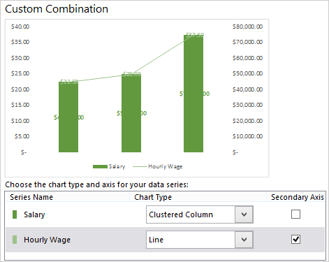
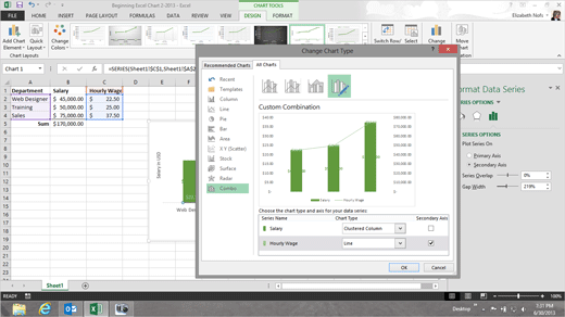
Exam 77-427 Microsoft Excel 2013 EXPERT Hold on, hold
on. There are two Series, one on top of the other. Please change the
Hourly Wage from a Column Chart to a Line. Then, you will be able to see both
data sets in the chart. Select the
Salary Chart. Go to
Chart Tools -> Format. Go to
Current Selection. Click on
Change Chart Type. This time, you should see Custom Combination. Click OK. Did it work? Let's see...
|
|

| |